Above the fold is a term that is used in digital design all the time. However, it came from a time long before computers were even invented. The term was first used back in the early days of newspaper printing. The fold is the literal fold in the newspaper, creating a top half and a bottom half. The most important consideration was on the front page. The layout had to show off the best headlines in that top half because that was all people saw on the newsstand – and still do today.
In a digital age, there isn’t a literal fold in the design of a website. However, the fold is used to refer to the line created by the bottom of the monitor. When you first land on a website, what you see before you start scrolling is above the fold and anything that appears once you start scrolling is below the fold.
Why Is This Important?
It’s the same concept as newspaper layout designers faced – the area above the fold is what will make people decide to engage with your website. If the design doesn’t show off your best features, such as a bonus on offer at Big Dollar, people will click away and find another website.
So, what do you put in this area?
- Catchy headings on each page to engage the reader
- A call to action with a clickable link or sign-up form
- Information that immediately tells the reader what the page is about
- Content that will help to achieve your business goals
- The best image or media that shows off the topic of the page
The most important thing to remember is that you should never waste this real estate. You should also run some tests with what you place in the section above the fold and see what performs best. This is where you are going to get the most sales, and it’s worth investing time and effort into getting it right.
How To Measure The Fold In A Digital World
One of the trickiest problems with designing around the fold for a website is that you can’t ever be sure exactly where that fold is. It’s a completely different beast to printing a newspaper because those pages remain the same size no matter who is reading the paper. The good news is that there are some screen size standards that you can work with:
- Computer Monitors – Among website designers, there is a consensus that the fold sits at 600 pixels from the top of the page. This is an average based on the most common computer monitor settings of 1024×786 pixels. It also assumes that the website visitor is using one of the commonly used web browsers and that the browser is maximized on the screen. Of course, this can be thrown out by the user having plugins or toolbars on their browser that alters the size of viewing screen. However, it’s a safe bet to use the 600 pixels consensus.
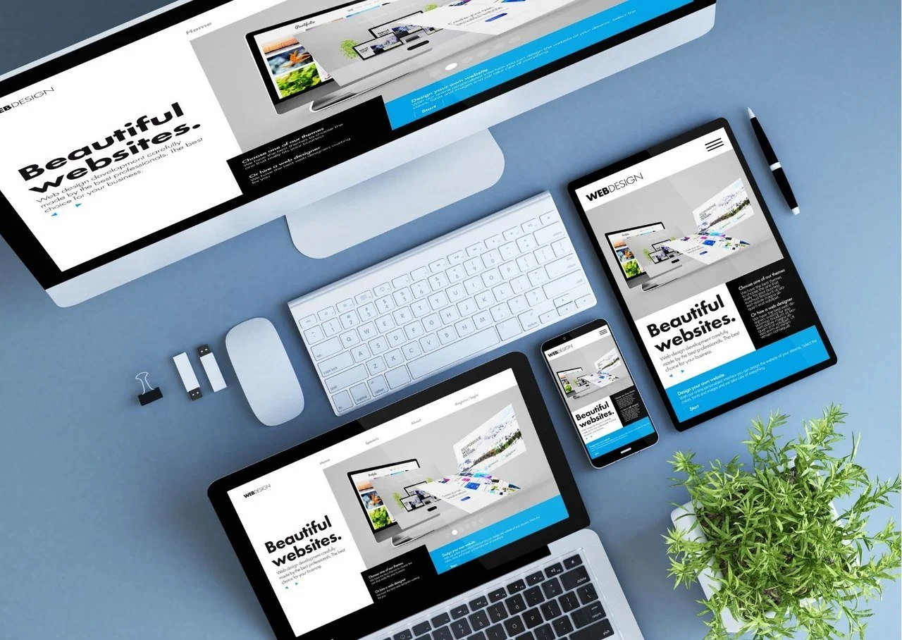
- Mobile Devices – The rise in mobile web browsing has thrown a major spanner in the works. Screen sizes on smartphones and tablets are widely varied, making judging where the fold is next to impossible. In addition to the range in screen sizes, you also must consider that people tend to browse with their phones or tablets in portrait mode rather than the traditional landscape mode of a computer. When it comes to mobile, responsive design is critical. A true responsive design is when the content on the web page is fluid and adapts to the screen size. However, you can ensure that the most important elements stay at the top of the page.
Leave a Reply