Color is a powerful tool that, in the hands of an experienced designer, affects human consciousness. If we are talking about business and such an important part of it as information signs, plates and numbers for doors, there are important rules in choosing the color of decoration, design, form. Do you want to attract and retain the attention of the company’s clients, create a special mood among hotel guests, influence the emotions of other people in the best way? Take a look at our tips based on scientific research on the psychology of color in marketing, advertising and business.
The rule of three
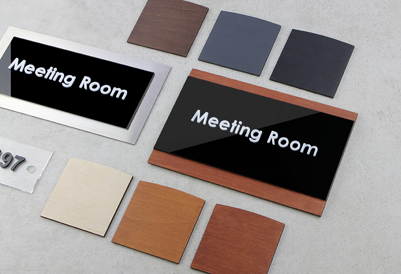
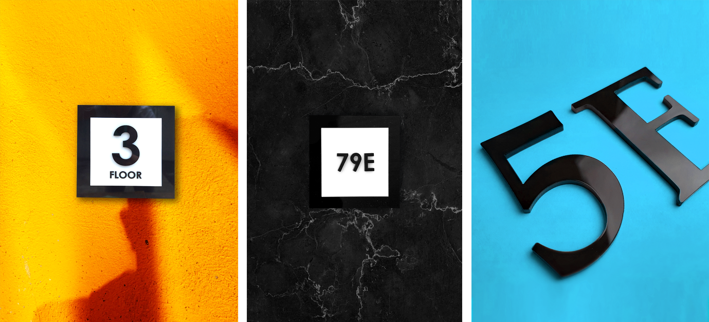
When choosing information signs or door sign numbers, consider 3 important nuances:
- each color, as well as their combinations, evoke certain associations, and it is important for them to be pleasant or at least neutral;
- the same front door number or sign can be perceived differently by men and women due to differences in the work of the psyche;
- there is a category of people who have problems with colour perception, but it does not mean that you should not take care of them, quite the opposite.
In addition, there are differences between the perception of colours and shades depending on nationality and region of residence. Therefore, do not be surprised if, looking at your sign in the office, a guest from the East pondered for a long time about the benefits of cooperation, and a Westerner met you halfway immediately.
Psychology of colour
Before buying numbers for front doors or signs, keep in mind that each colour evokes certain associations, feelings and encourages action / inaction:
- red – danger, importance, passion;
- orange – confidence, energy, optimism;
- yellow – sun, happiness, attention;
- green – nature, development, success;
- blue – comfort, relaxation, trust;
- purple – luxury, spirituality, creativity;
- black – strength, grace, refinement;
- white – health, purity, chastity;
- gray – formality, neutrality, professionalism.
When you are choosing a design for exterior door number signs, information plates, it is important to understand that some colours go beyond the associative range. For example, blue is the main color of the tourism industry, green is everything related to healthy eating and environmental friendliness, red is a symbol of fast food.
Instead of a conclusion
Your numbers for apartment doors and signs should fit in, complement, or give direction to your corporate identity. Here you can go in 2 ways: the classic (takes into account the associations caused by a particular colour) and unconventional (involves abandoning the rules of colour psychology and creating a catchy image that goes against the generally accepted opinion / understanding). To make your choice correct and your corporate identity effective, we recommend contacting BSign. It is a manufacturing enterprise specialized in modern door number signs. They will make high-quality, stylish, hand-made and eye-catching signs and door numbers for you.
Leave a Reply